
Reading the Money Map: How to Analyze Any Company's Profit Flow
Learn to read Sankey diagrams and instantly spot business quality through revenue-to-profit flow patterns. Compare Microsoft, Netflix, and Costco's fundamentally different economics.
Every company tells a story through its financials, but most investors struggle to see it. Revenue sits in one section of the 10-K, expenses in another, margins scattered across tables. The connections, how money actually flows through a business, remain invisible.
We built an interactive visualization to solve this: a snakey diagram that traces every dollar from revenue to net income. This guide shows you how to read these diagrams and what patterns reveal about business quality.
What is a Revenue Flow Diagram?
A sankey diagram visualizes flows through width. In financial analysis, each stream's width represents dollar amounts, creating an instant picture of how revenue transforms into profit.
The diagram flows left to right, mirroring an income statement: Revenue → Cost of Revenue → Gross Profit → Operating Expenses → Operating Income → Taxes/Interest → Net Income.
Width equals magnitude. The wider the stream, the larger the dollar amount. This makes patterns instantly visible that would take minutes to calculate from raw statements.
We use an intuitive color system to distinguish financial flows. Blue streams represent revenue sources, including products, business segments, and geographic regions. Red and pink streams indicate expenses, such as cost of goods sold, research and development, selling, general and administrative costs, and taxes. Green streams reflect profit measures, including gross profit, operating income, and net income.
The Four Critical Layers
Every diagram follows the same structure, but patterns reveal fundamentally different business models.
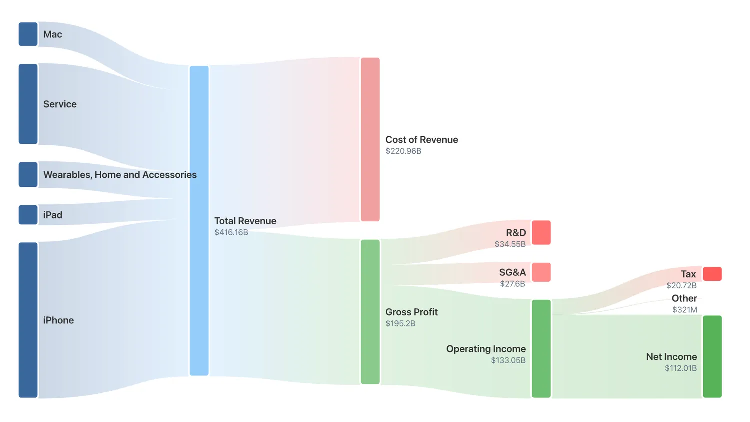
Figure 1: Apple's revenue segmentation diagram
Layer 1: Revenue Composition
The first layer shows what the company sells and where money comes from. Assess whether revenue is concentrated in one dominant stream or spread across multiple streams. A single dominant stream representing 80% or more of total revenue indicates strong focus but introduces significant risk. In contrast, multiple balanced streams suggest greater stability, though this may come at the cost of specialization.
Consider the quality of revenue, as recurring sources such as subscriptions are typically more predictable and valued more highly than one-time product sales. Changes in stream width over time indicate which segments are growing or contracting.
For example, in Apple's snakey diagram, the first thing that jumps out: iPhone dominates at roughly 50% of total revenue. Despite years of "Apple is diversifying" headlines, despite the explosive growth of Services, despite new product categories like AirPods and Apple Watch, the iPhone remains the gravitational center of Apple's solar system. This creates both Apple's greatest strength and its biggest vulnerability.
Layer 2: Gross Margin Architecture
After revenue, the diagram splits into Cost of Revenue (red) and Gross Profit (green). The green bar represents gross margin, which reveals the fundamental economics of the business. Gross margins above 65% are generally considered exceptional, while margins between 50% and 65% are high. Margins in the 35% to 50% range are strong, and margins between 20% and 35% are adequate. Margins below 20% are typically considered low.
However, context matters significantly as these thresholds vary considerably across industries and sectors, with some business models naturally operating at higher or lower margins. High gross margins indicate pricing power and provide cushion for investment and downturns, while low margins demand volume and operational excellence to generate acceptable returns.
For example, Apple takes in $416 billion in revenue. After subtracting the Cost of Revenue ($221B), they're left with $195 billion in Gross Profit. That's a 47% gross margin. For a company that manufactures and ships physical hardware products (phones, laptops, tablets) a 47% gross margin is extraordinary.
Layer 3: Operating Expense Allocation
This layer shows where gross profit gets spent: R&D (future competitiveness), SG&A (sales/marketing/overhead), and other operating expenses. The allocation reveals strategic priorities, with R&D-intensive companies investing heavily in innovation while others focus on sales and distribution or operational efficiency.
The width of the Operating Income stream shows operating margin, a critical measure of profitability after all operating expenses. Margins above 30% are considered exceptional, while margins between 20% and 30% are high. Margins in the 12% to 20% range are strong, and margins between 5% and 12% are adequate. Margins below 5% indicate low operating efficiency. As with all financial metrics, context matters as these thresholds vary considerably across industries, with some sectors naturally operating at higher or lower margins due to their business model and competitive dynamics.
For example, from $195B in gross profit, Apple has to fund operations (Research & Development: $34.5B, SG&A: $27.6B) and is left with an operating Income of $133B (32% operating margin). This is where Apple's business model truly shines. A 32% operating margin means for every $100 in revenue, $32 becomes operating profit (before interest and taxes). Apple sits in the elite tier of operating efficiency alongside Microsoft.
Layer 4: Net Income
The final layer shows taxes, interest, and non-operating items. What remains is Net Income, profit available to shareholders.
Net margin serves as a comprehensive quality indicator for the entire business model. Margins above 25% are considered exceptional, while margins between 15% and 25% are high. Margins in the 8% to 15% range are strong, and margins between 3% and 8% are adequate. Margins below 3% indicate low profitability. As with other margin metrics, these thresholds should be interpreted in the context of the specific industry and business model, as structural differences across sectors lead to varying baseline profitability levels.
For example, Apple pays income tax, interest expense and other Non-operating items from that $133B in operating income. After all deductions, Apple's net income is $112B (27% net margin), i.e., $112 billion in profit on $416 billion in revenue. This is the holy grail of business: massive scale combined with exceptional profitability.
Now let's see how three very different companies appear through this lens.
Example 1: Microsoft: The Diversified Margin Machine
FY2025: $281.7B Revenue
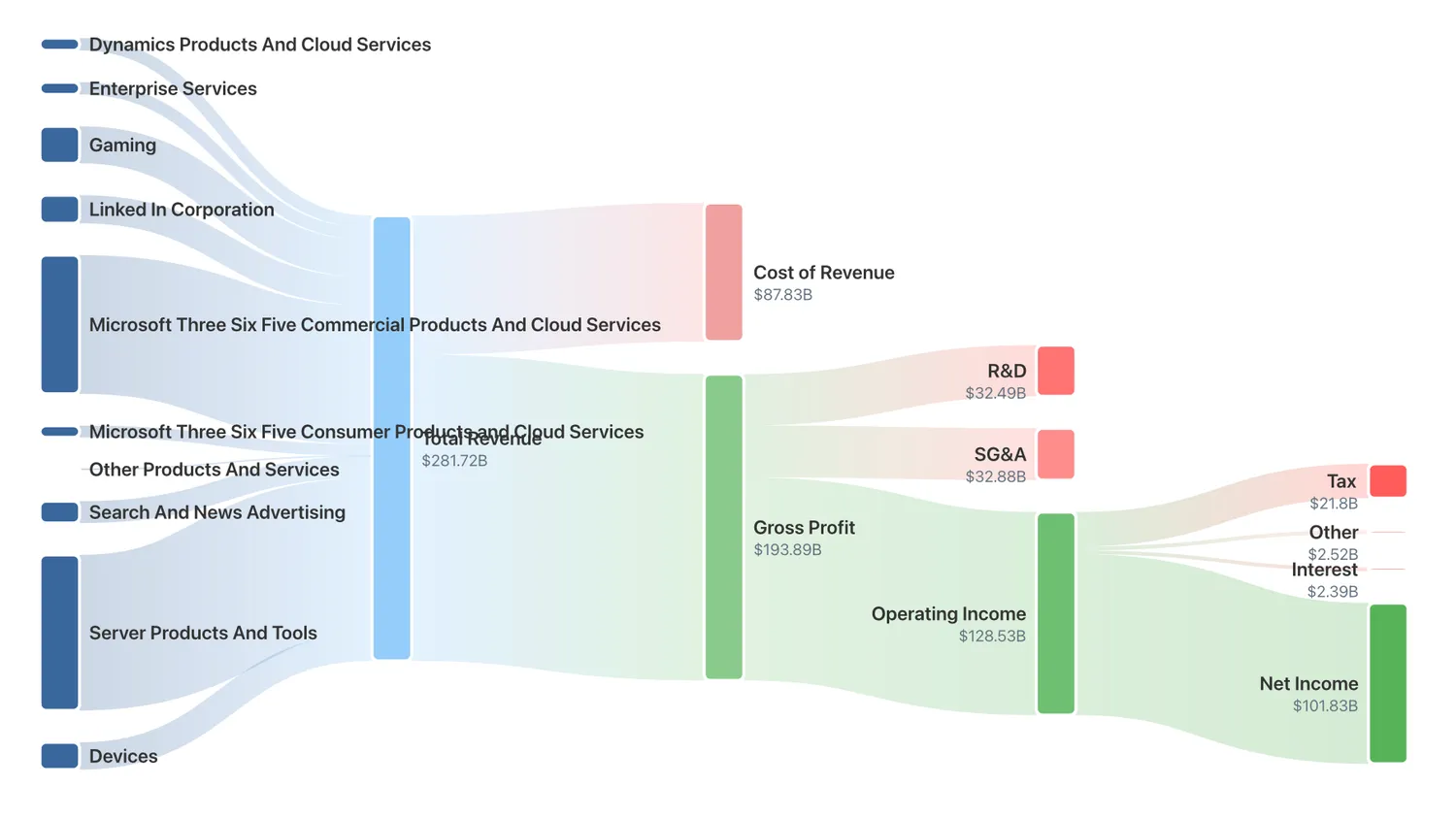
Figure 2: Microsoft's revenue segmentation diagram
Revenue Structure
Microsoft's diagram immediately reveals diversification. Ten distinct product segments flow into total revenue, with major categories including Server Products and Tools (Azure, cloud infrastructure), Microsoft 365 Commercial Products and Cloud Services, Dynamics Products and Cloud Services, Gaming (Xbox, game content), and LinkedIn, Search and News Advertising, and Devices. No single product dominates completely, creating resilience where weakness in one area can be offset by strength in others.
Margin Architecture: 68.8% Gross Margin
After $87.8B in Cost of Revenue, Microsoft retains $193.9B in gross profit, i.e., a 68.8% gross margin. This is characteristic of software and cloud businesses where each additional Azure customer or Office 365 subscription generates minimal incremental cost. The diagram makes this tangible: that massive green gross profit bar shows Microsoft keeps nearly 70 cents of every revenue dollar before spending on R&D or sales.
Operating Leverage: 45.6% Operating Margin
From $193.9B gross profit, Microsoft invests $32.5B in R&D (11.5% of revenue) for AI, cloud, and gaming innovation, and $32.9B in SG&A (11.7% of revenue) for sales, marketing, and support. These are substantial in absolute dollars but moderate as percentages. After operating expenses, Microsoft generates $128.5B in operating income, a 45.6% operating margin. This places Microsoft in the top tier of large-cap profitability, indicating structural advantages such as network effects, switching costs, and ecosystem lock-in.
Bottom Line: 36.1% Net Margin
After $21.8B in taxes and $2.4B in interest, Microsoft delivers $101.8B in net income, a 36.1% net margin.
The pattern reveals multiple growth engines, exceptional margins, disciplined reinvestment, and operating leverage that improves with scale. This is a compounding machine.
Example 2: Netflix: The Focused Subscription Model
FY2025: $45.2B Revenue
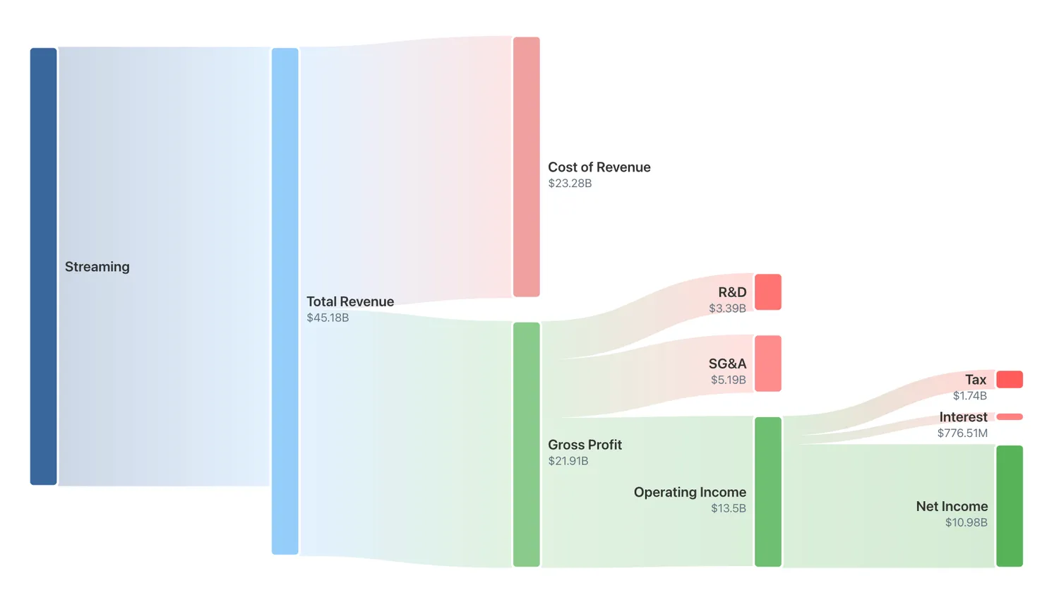
Figure 3: Netflix's revenue segmentation diagram
Revenue Structure: Pure Focus
Netflix's diagram shows stark simplicity: one massive blue bar labeled "Streaming" representing 97%+ of revenue. Unlike Microsoft's diversification, Netflix has one business: monthly subscriptions for streaming video. This concentration creates operational simplicity but amplifies execution risk, as any threat to streaming directly impacts the entire business.
Margin Architecture: 48.5% Gross Margin
After $23.3B in Cost of Revenue (content production, streaming infrastructure), Netflix retains $21.9B in gross profit, a 48.5% gross margin. This is significantly lower than Microsoft's 68.8%, reflecting content production's capital intensity. However, Netflix's gross margin has expanded from around 35% five years ago.
Operating Discipline: 29.5% Operating Margin
From $21.9B gross profit, Netflix invests $3.4B in R&D (7.5% of revenue) for technology platform and personalization, and $5.2B in SG&A (11.5% of revenue) for marketing and subscriber acquisition. After operating expenses, Netflix generates $13.3B in operating income, a 29.5% operating margin. While lower than Microsoft's 45.6%, this represents strong profitability for content production and significant improvement from historical levels.
Bottom Line: 24.3% Net Margin
After taxes and interest, Netflix delivers $11.0B in net income, a 24.3% net margin. The pattern reveals high concentration but improving efficiency. The narrower streams compared to Microsoft don't indicate inferior quality. They reflect different economics. Netflix operates in a capital-intensive industry but has achieved profitability through scale and operational excellence.
Example 3: Costco: The Scale and Volume Play
FY2025: $275.2B Revenue
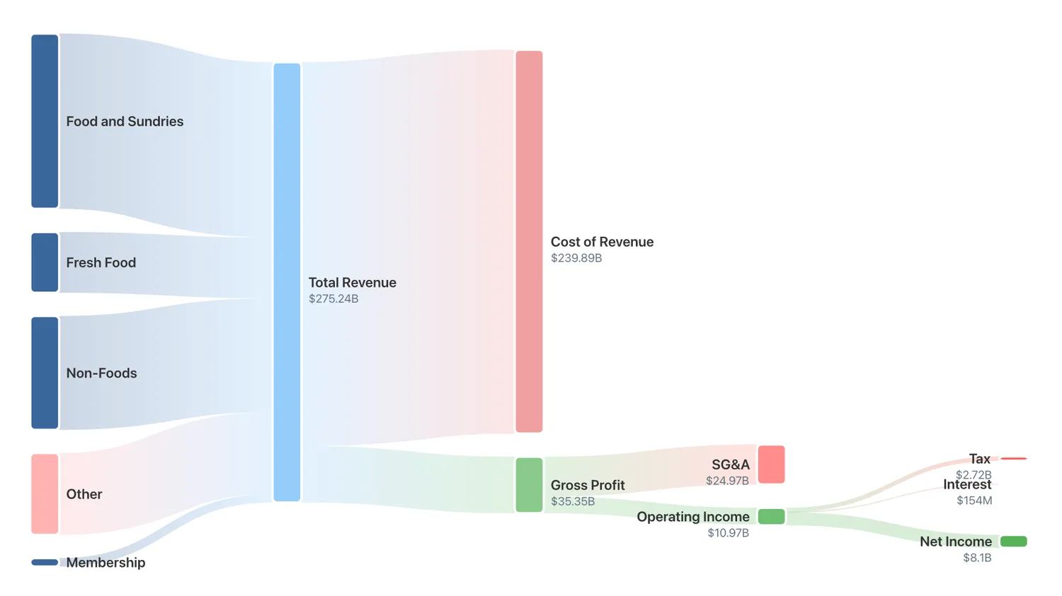
Figure 4: Costco's revenue segmentation diagram
Revenue Structure: Categories at Scale
Costco's diagram shows five product categories flowing into total revenue: Food and Sundries (largest segment), Fresh Food, Non-Foods, Other, and a thin stream for Membership fees.
Despite having product diversity, notice something critical: there's also a small pink stream labeled "Other" feeding INTO revenue alongside the blue product streams. This is membership revenue, and it's the key to Costco's model.
Margin Architecture: 12.8% Gross Margin
After $239.9B in Cost of Revenue, Costco retains just $35.3B in gross profit, i.e., a 12.8% gross margin. This is dramatically lower than both Microsoft (68.8%) and Netflix (48.5%). The diagram tells the story visually: that red Cost of Revenue bar is nearly as wide as total revenue. Costco operates on razor-thin product margins.
The Membership Insight: 3.8% Operating Margin
From $35.3B gross profit, Costco spends $25.0B in SG&A (9.1% of revenue) for store operations and labor. Operating income is just $10.4B, a 3.8% operating margin. The diagram shows operating income as a relatively narrow green stream. But here's the critical insight: Costco's entire operating income ($10.4B) is roughly equivalent to its membership fee revenue. The business model is to sell merchandise near cost, then capture profit from membership fees. Members get low prices; Costco gets predictable, high-margin recurring revenue.
Bottom Line: 2.9% Net Margin
After taxes, Costco delivers $8.1B in net income, a 2.9% net margin. The pattern reveals massive scale with minimal product margins offset by high-margin membership revenue. The diagram's thin green streams don't indicate poor business quality; they show a fundamentally different model optimized for volume and customer loyalty.
What These Patterns Reveal
Comparing all three diagrams side-by-side teaches us to recognize business model archetypes. Microsoft's wide green streams indicate high-margin, asset-light, software-driven economics with multiple revenue engines. This pattern is characteristic of enterprise SaaS, cloud infrastructure, and platform businesses where incremental costs remain low as revenue scales. Netflix's moderating flow represents a capital-intensive content business achieving scale. Costco's compressed margins reveal a volume-driven retail model with the membership twist. The thin profit streams relative to massive revenue indicate efficiency at scale, not poor quality. This pattern is common in warehouse retail and similar models where customer loyalty and recurring membership fees enable razor-thin product margins.
Geographic Lens
The same P&L can be viewed through a different lens. While product segmentation reveals what a business sells, geographic segmentation shows where the money comes from. And this tells an equally important story.
The Americas Segment generates the largest revenue flow ($20.0B), representing Netflix's home market strength. Europe, the Middle East, and Africa (EMEA) contributes significantly as Apple's second-largest market ($14.5B). Asia Pacific and Latin America contribute about $5B each, suggest room for growth in developing markets.
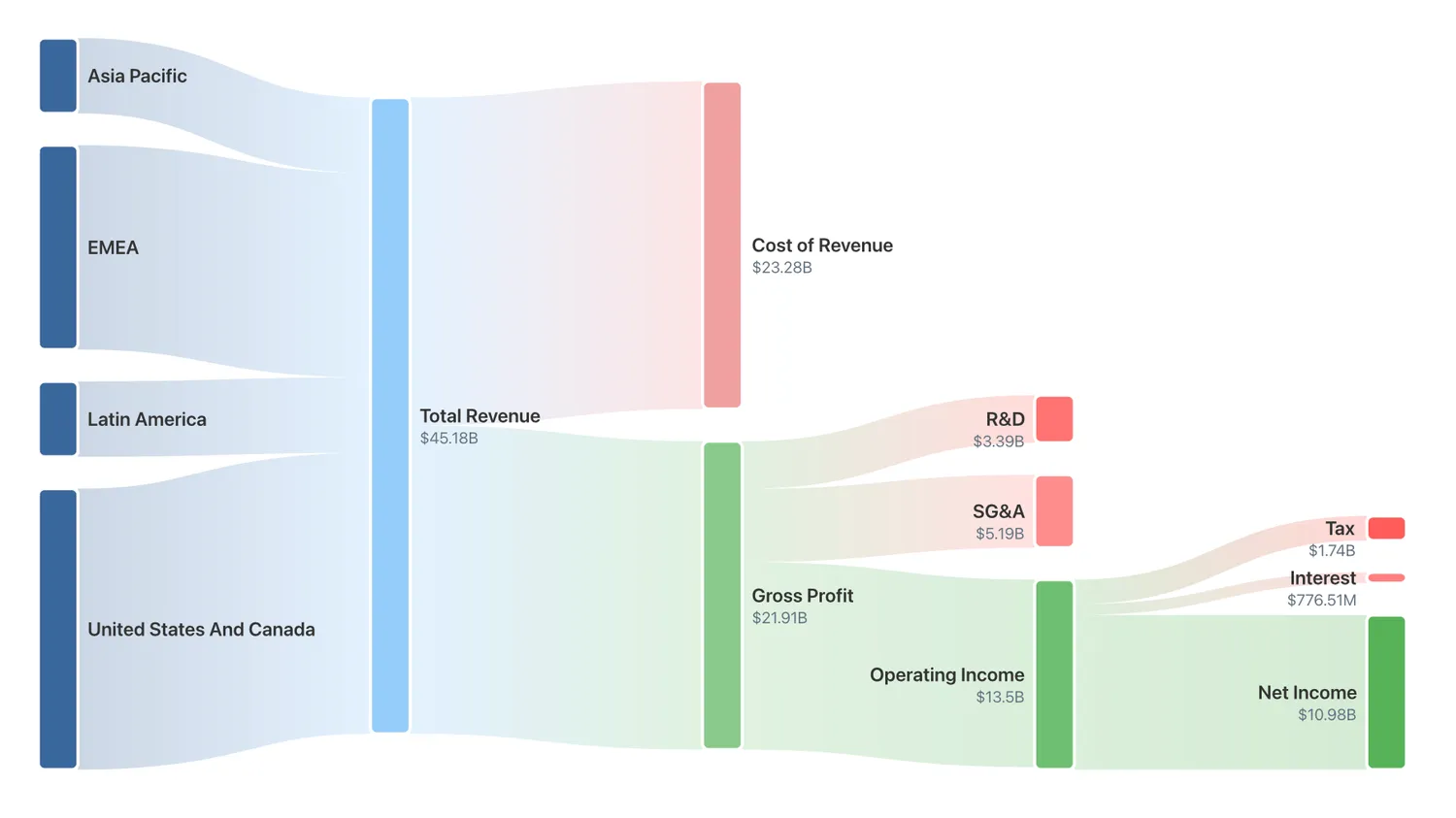
Figure 5: Netflix's geographic revenue segmentation diagram
Connecting to Deeper Analysis
Revenue segmentation provides the foundation for comprehensive company analysis but cannot stand alone. Understanding what a company sells and where that revenue originates creates context for evaluating business quality, competitive position, and valuation. That is why it is included in the Overview page in our 5D Framework approach.
Quality analysis examines whether the underlying business generates sustainable returns across fundamental pillars like margins, cash flow quality, and return on capital. Peer analysis reveals how revenue structure compares to competitors. Does this company's concentration level represent industry standard or meaningful deviation? Valuation analysis determines what that revenue stream is actually worth. Analyst and holdings analysis show whether professional investors view the revenue structure as strength or weakness.
Strong alignment across dimensions creates conviction. When revenue concentration in high-margin products combines with quality fundamentals, reasonable valuation, and insider buying, the concentration represents focused strength rather than vulnerability. Divergence demands investigation. When revenue appears well-diversified but quality metrics deteriorate, peer rankings decline, and insiders sell, the diversification might mask underlying problems rather than create resilience.
Try It Yourself
These revenue flow diagrams are available for most S&P 1500 companies on our Overview Dashboard. It presents complete revenue breakdowns with interactive Sankey diagrams showing product and geographic segments.
You can explore how different industries structure their economics and develop pattern recognition for business quality. The diagram instantly answers questions that would otherwise require spreadsheet calculations:
- Where does revenue actually come from?
- How much profit remains at each stage?
- Is this a high-margin or volume business?
- Where does the company invest (R&D vs. marketing)?
Understanding these patterns helps you evaluate business models, spot competitive advantages, and avoid value traps - all before diving into detailed financial analysis.
From Overview Dashboard, dive into Quality, Peers, Valuation, Analysts, and Holdings analysis to build a complete picture.
This article is an updated version of the blog originally published on X on 23 January 2026. It has been revised with new examples and refreshed data as of 13 February 2026.
Data as of fiscal year 2025 (Apple, Microsoft, Costco) and fiscal year 2024 (Netflix). Revenue and income statement figures sourced from company 10-K filings via Financial Modeling Prep API.
This article is for educational purposes only and does not constitute investment advice. Always conduct your own research and consider consulting with financial professionals before making investment decisions.