
Business Quality Analysis: The Foundation of the 5D Framework
Why some companies generate consistent returns across decades while others struggle through cycles, revealed through systematic quality analysis.
Two technology companies generate billions in revenue. One consistently produces 25%+ returns on equity with expanding margins and robust cash flow. The other struggles with single-digit returns, compressing margins, and disappearing cash. The first weathers downturns and emerges stronger. The second requires constant capital infusions and restructuring.
The difference is business quality, the systematic ability to convert capital into sustainable returns. This becomes visible through financial statements examined across time and multiple performance dimensions. Before considering analyst views, stock price, or ownership, you need to know whether the business creates genuine economic value.
Why Quality Comes First
Investment analysis follows logical progression. Quality establishes whether a business deserves investigation. No amount of professional optimism, attractive valuation, or insider buying compensates for weak business economics. A company that destroys capital at any price scores poorly on these fundamentals.
Ten years of financial data strips away economic cycle noise. A company might look brilliant during expansion. But examine performance through 2008 and COVID-19 and you see which businesses possess genuine competitive advantages versus those that benefited from favorable conditions. Quality companies maintain returns through downturns.
Every subsequent dimension builds on quality. Peer analysis compares to competitors, but that comparison means nothing if the underlying business generates poor returns. Valuation calculations for deteriorating businesses produce misleading results. Analyst sentiment and holdings must be interpreted against fundamental reality. Strong quality with reasonable valuation and smart money accumulation creates conviction.
The 10 Pillars Framework
We analyse business quality through ten fundamental categories, each measuring different aspects of financial performance. These pillars organize 40 financial metrics into a comprehensive assessment that captures returns, efficiency, growth, and financial strength.
1. Top line growth
Top line growth tracks revenue expansion, EBITDA growth, and net income growth over multiple years. Consistent double-digit growth across all three metrics signals a business gaining market share or expanding into new markets successfully. Declining revenue coupled with margin compression indicates fundamental deterioration that no financial engineering can offset permanently. Growth combined with margin expansion represents the ideal pattern, demonstrating both scale and improving unit economics.
Example: Amazon demonstrates exceptional growth. While revenue increased at a 20% CAGR, profitability expanded at a significantly faster pace, with EBITDA growing 33%, EBIT rising 42%, and net income advancing 47%. The chart reveals Amazon's transformation from a low profit business in 2016 to a profit-generating machine by 2025, as AWS matured and infrastructure investments began paying dividends. Revenue tripled from $135B to over $717B while profits accelerated from breakeven to substantial scale.
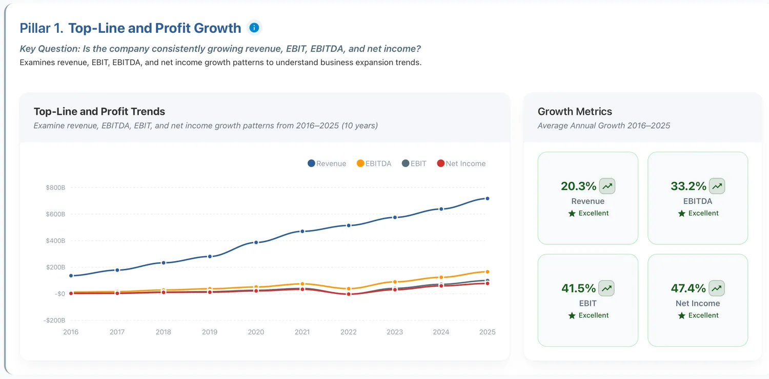
Figure 1: Amazon's excellnt growth metrics
2. Per share fundamentals
Per share fundamentals matter because they reflect what shareholders actually receive. A company can grow earnings while destroying per-share value through excessive dilution. Revenue per share, earnings per share, and book value per share should all grow over time. When aggregate metrics expand but per-share metrics stagnate, management is enriching itself at shareholder expense.
Example: Amazon's per-share fundamentals reveal strong shareholder value creation: 19% revenue per share growth, 45% net income per share growth, 39% book value per share growth, and 42% tangible book value per share growth. Despite issuing shares for employee compensation and acquisitions over the decade, all metrics accelerated sharply upward. The widening gap between revenue per share and earnings per share demonstrates powerful operating leverage, with shareholders capturing disproportionate profit growth even as the share count increased.
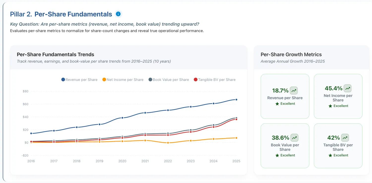
Figure 2: Amazon's per share fundamentals reveal strong shareholder value creation
3. Margin Efficiency
Margin efficiency measures the ability to convert revenue into profit at each stage of the income statement. Gross margin reveals pricing power and cost structure. Operating margin shows efficiency after accounting for overhead. Net margin captures what actually remains after all expenses. EBITDA margin provides insight into cash-generating ability before non-cash charges. Companies with expanding margins over time typically possess strengthening competitive positions. Compressing margins signal intensifying competition or operational problems.
Example: Microsoft demonstrates strong margin efficiency across all levels: 69% gross margin, 52% EBITDA margin, 43% operating margin, and 36% net margin. The decade-long trend shows consistent improvement and stability, with all four metrics expanding or holding firm, indicating strong pricing power and operating leverage.
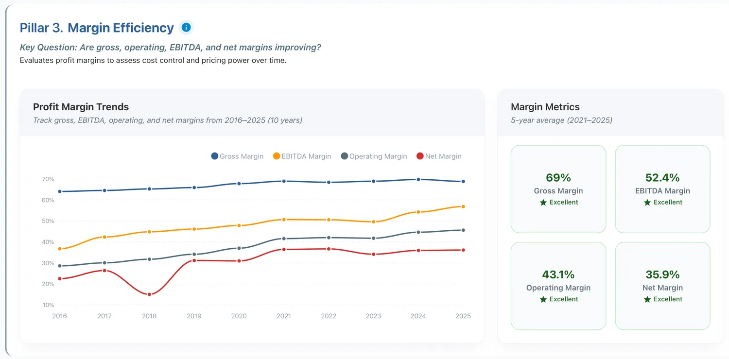
Figure 3: Microsoft demonstrates strong margin efficiency across all levels
4. Operational efficiency
Operational efficiency measures how well companies convert assets into sales and manage working capital. Asset turnover reveals whether the business requires significant capital investment to generate each dollar of revenue. High turnover indicates capital-light business models. Cash conversion cycles show how long capital gets tied up in inventory and receivables before collecting cash. Efficient companies minimize this cycle, generating cash quickly from operations.
Example: Costco demonstrates strong operational efficiency across all metrics: 3.5× asset turnover, 3.7 days sales outstanding, 30 days inventory outstanding, and just 1.8 days cash conversion cycle. These numbers reveal Costco's core advantage: inventory turns rapidly (every 30 days), customers pay immediately (under 4 days), but suppliers get paid on extended terms. The result is a cash conversion cycle of 1.8 days, meaning Costco operates with a near-neutral working capital position that is effectively self-funding rather than a material cash drain.
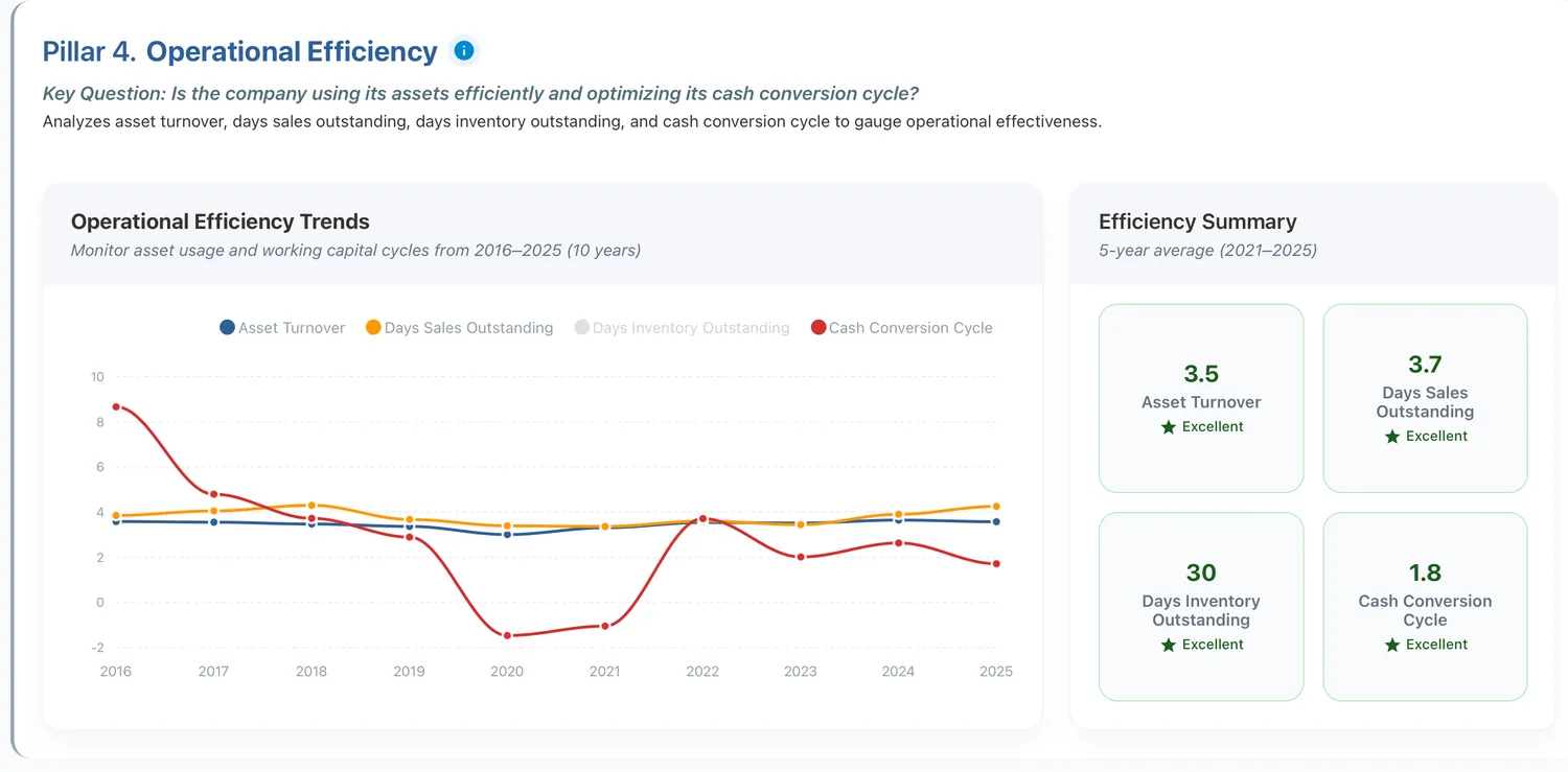
Figure 4: Costco demonstrates strong operational efficiency across all metrics
5. Returns Overview
Returns overview examines whether management converts shareholder capital into profits effectively. This pillar evaluates return on equity (ROE), return on invested capital (ROIC), return on asset (ROA), and return on capital employed (ROCE). These metrics reveal competitive advantage. Companies generating 20%+ returns on equity possess some combination of pricing power, operational efficiency, or market position that allows them to earn exceptional profits relative to the capital required. Single-digit returns suggest commodity businesses with limited differentiation.
Example: Deckers' return metrics tell a transformation story: from near-zero returns in 2017 to exceptional performance across all dimensions by 2025, with ROIC at 26%, ROE at 32%, and ROCE at 35%. All four metrics show consistent upward momentum, indicating improving capital efficiency and operational excellence.
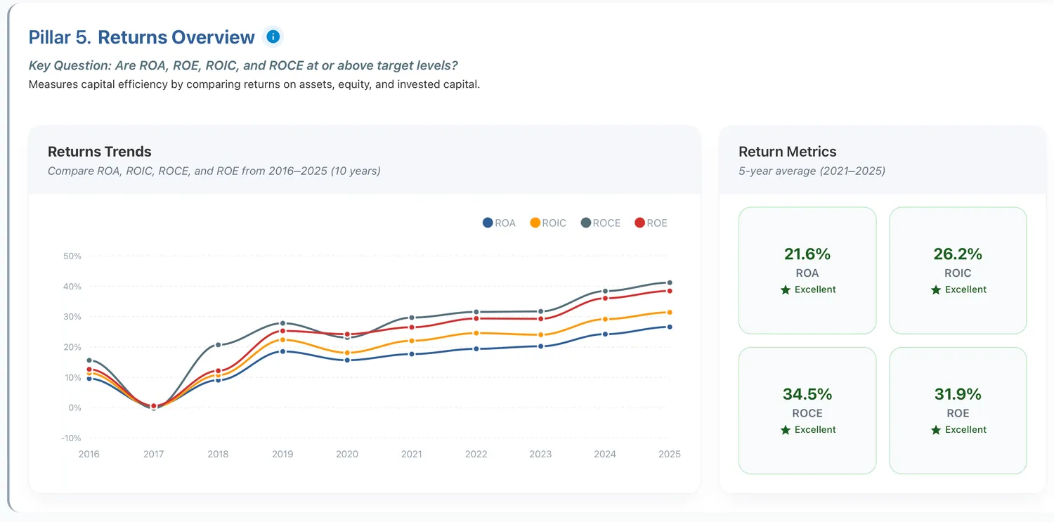
Figure 5: Deckers' return metrics are excellent
6. Cash Flow Quality
Cash flow quality determines whether accounting profits translate to actual cash. A company can report strong earnings while burning cash through working capital expansion or excessive capital expenditure. Free cash flow relative to net income reveals this relationship. Income quality ratios above 1.0 indicate the business generates more cash than reported earnings, suggesting conservative accounting. Ratios below 0.5 raise questions about earnings quality and sustainability.
Example: Adobe exemplifies excellent cash flow quality with an income quality ratio of 1.5, meaning operating cash flow consistently exceeds reported earnings by 50%. The decade-long trend shows steady expansion from around $3B to over $8B in operating cash flow, with free cash flow tracking closely behind due to minimal capital requirements. This is characteristic of subscription software businesses where customers pay upfront but revenue is recognized over time.
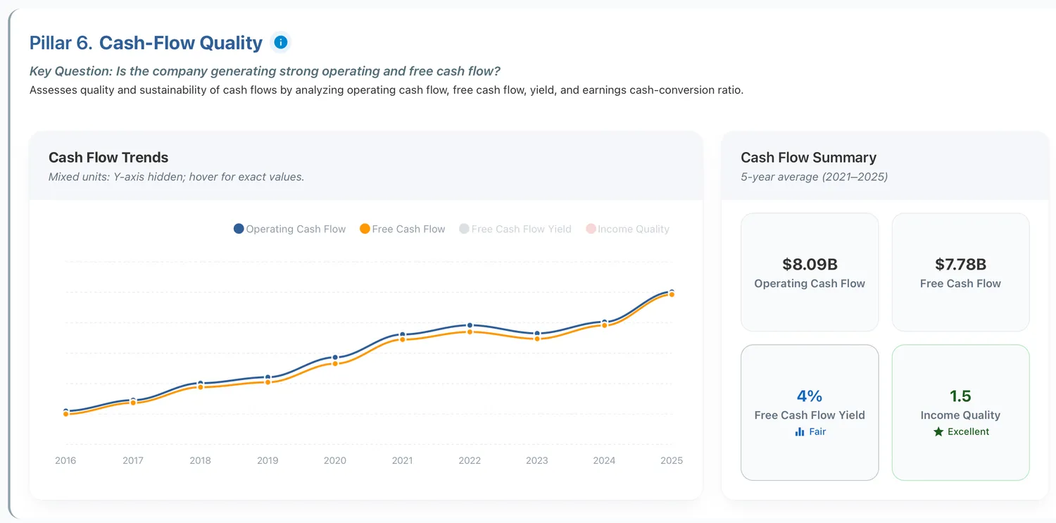
Figure 6: Adobe exemplifies excellent cash flow quality
7. Liquidity and working capital
Liquidity and working capital measure short-term financial flexibility. Current ratios and quick ratios reveal whether companies can meet near-term obligations without external financing. Strong liquidity provides options during market disruptions. Weak liquidity creates vulnerability to credit market freezes.
Example: Meta demonstrates strong liquidity with a 2.6 current ratio and 2.6 quick ratio, both well above the safety threshold. The decade-long trend reveals a deliberate shift from extremely conservative cash management to more efficient capital deployment. As Meta matured, excess cash declined while working capital turnover improved to 3×, indicating the company now generates more revenue per dollar of working capital. This reflects a transition from hoarding cash to deploying it productively through buybacks, capex, and operations while maintaining ample liquidity buffers.

Figure 7: Meta demonstrates strong liquidity and working capital management
8. Leverage and coverage
Leverage and coverage determine survival ability during stress periods. Debt-to-equity ratios reveal how much financial leverage the business employs. Interest coverage shows whether operating income comfortably exceeds debt service requirements. Companies with minimal debt and strong coverage can weather economic storms and invest opportunistically when competitors struggle with covenant breaches and refinancing pressure.
Example: Salesforce maintains an exceptionally strong balance sheet with minimal leverage: 0.2 debt-to-capital, 0.2 debt-to-equity, and 0.2 net debt-to-EBITDA ratios all indicate the company operates with very little debt relative to its size and profitability. The 28× interest coverage ratio means EBITDA exceeds interest expenses by a factor of 28, providing massive cushion for downturns and financial flexibility for strategic investments or acquisitions.
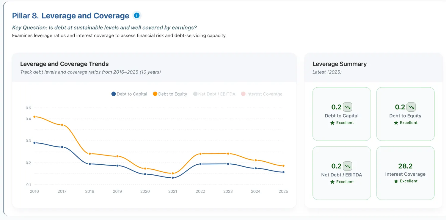
Figure 8: Salesforce has a strong balance sheet
9. Valuation multiples
Valuation multiples provide context for whether current prices reflect underlying business quality. While detailed valuation analysis belongs in Dimension 3, this pillar examines whether quality companies trade at reasonable multiples relative to their historical ranges and growth rates.
Example: Verizon trades at modest valuation multiples characteristic of mature, capital-intensive telecoms: 10× P/E, 1.6× P/B, 7.4× EV/EBITDA, and 2.6× EV/Sales. The decade-long trend reveals significant multiple compression - P/E declined from 16.6× in 2016 to 10× today, and P/B collapsed from around 10× to 1.6×. This re-rating reflects the market's recognition of Verizon's limited growth prospects in a saturated wireless market, high capital requirements for network infrastructure, and competitive pressure.
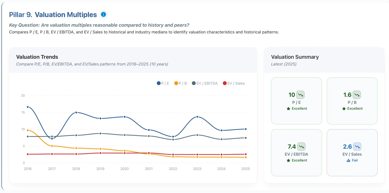
Figure 9: Verizon trades at modest valuation multiple
10. Dividend metrics
Dividend metrics evaluate management confidence in cash flow sustainability. Consistent dividend growth backed by strong payout coverage suggests a business generating more cash than it can reinvest profitably. Dividend cuts signal deteriorating fundamentals or previous distributions that exceeded sustainable levels.
Example: Johnson & Johnson exemplifies sustainable dividend excellence: 2.5% yield, $5.10 per share, 46% payout ratio, and 2.2× coverage ratio. The decade-long trend shows dividend per share climbing steadily from around $3 to over $5, demonstrating consistent growth. The conservative 46% payout ratio means J&J retains over half of earnings for reinvestment while still rewarding shareholders, and the 2.2× coverage ratio provides substantial cushion.
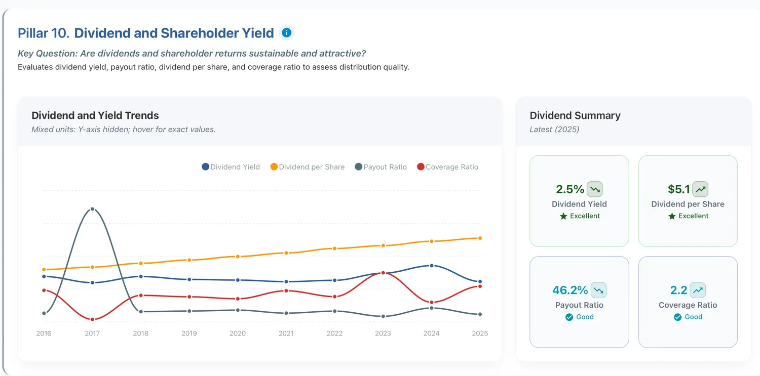
Figure 10: Johnson & Johnson exemplifies sustainable dividend excellence
Patterns of Quality in Practice
The ten-pillar framework produces scores from 1.0 to 5.0 that reveal business quality patterns. Examining specific companies illustrates what these patterns mean in practice.
Excellence Across Dimensions
NVDA demonstrates what systematic quality looks like. The company scores 4.0 overall with perfect 5.0 scores in returns, margins, and top line growth. Perfect leverage coverage combines with strong per-share fundamentals. This pattern reveals a business with exceptional pricing power, expanding market opportunity, and disciplined capital allocation.
Perfect margin scores indicate the ability to convert revenue into profit at extraordinary rates. Perfect return scores show management generating exceptional profits on invested capital. Perfect growth scores demonstrate the business expanding rapidly while maintaining those exceptional economics. The combination creates a quality profile rarely achieved across extended time periods.
The weak valuation score of 1.0 becomes significant in this context. Exceptional business quality frequently commands premium valuations. Whether that premium proves justified requires deeper valuation analysis in Dimension 3. But the quality foundation establishes that this represents a genuinely superior business, not financial engineering or accounting tricks.
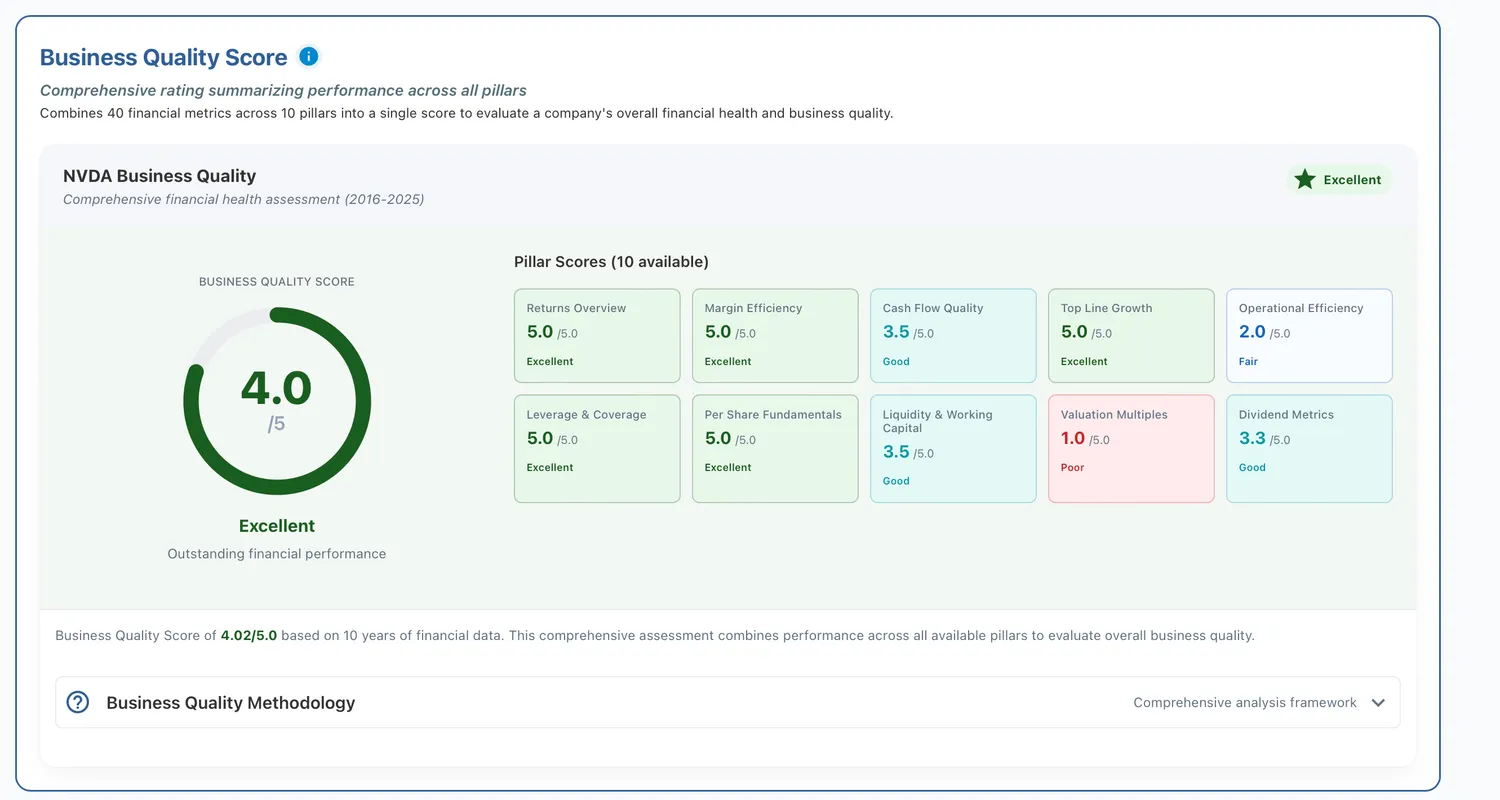
Figure 11: NVIDIA business qulity score card.
Strength with Limitations
VRSK presents a different pattern. The 3.5 overall score places it in solid quality territory but reveals specific weaknesses. Perfect margin efficiency scores and strong return scores demonstrate excellent profitability. But the 2.3 growth score and 2.5 per-share fundamentals score indicate constraints.
This pattern suggests a mature business model with excellent economics but limited expansion opportunities. The company converts existing operations into profit extremely efficiently. But it struggles to deploy incremental capital into new growth avenues that match existing returns. Per-share fundamental weakness combined with limited growth raises questions about whether shareholders benefit from business expansion or whether growth destroys per-share value through dilution.
The 1.0 valuation score compounds this concern. A slowly growing business with per-share value creation challenges trading at a premium multiple creates unfavorable risk-reward. Quality analysis reveals the business generates good returns, but other dimensions must justify the valuation premium or the opportunity disappears.
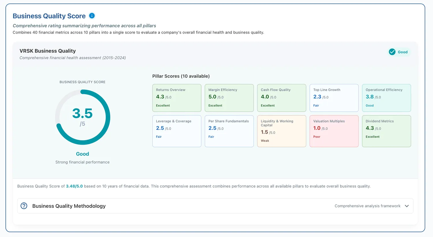
Figure 12: Verisk Analytics business qulity score card.
Systematic Deterioration
BA illustrates systematic quality problems across multiple dimensions. The 1.5 overall score results from widespread weakness. Returns score 2.0. Margins score 1.0. Cash flow quality scores 1.0. Growth scores 1.0. The pattern reveals fundamental business problems, not temporary challenges.
Poor 1.0 scores in margins, cash flow, and growth indicate the business destroys value across all key performance areas. The company cannot convert revenue into profit efficiently. Reported earnings do not translate to cash. The business contracts rather than expands. These are not cyclical problems that recovery will solve. They represent structural challenges requiring major operational overhauls or business model transformation.
The 4.0 dividend score becomes misleading in this context. Dividends supported by deteriorating fundamentals cannot persist. Either management cuts dividends to preserve capital, or they deplete resources maintaining distributions the business cannot sustain. Quality analysis reveals the dividend represents a lagging indicator of past strength, not evidence of current health.
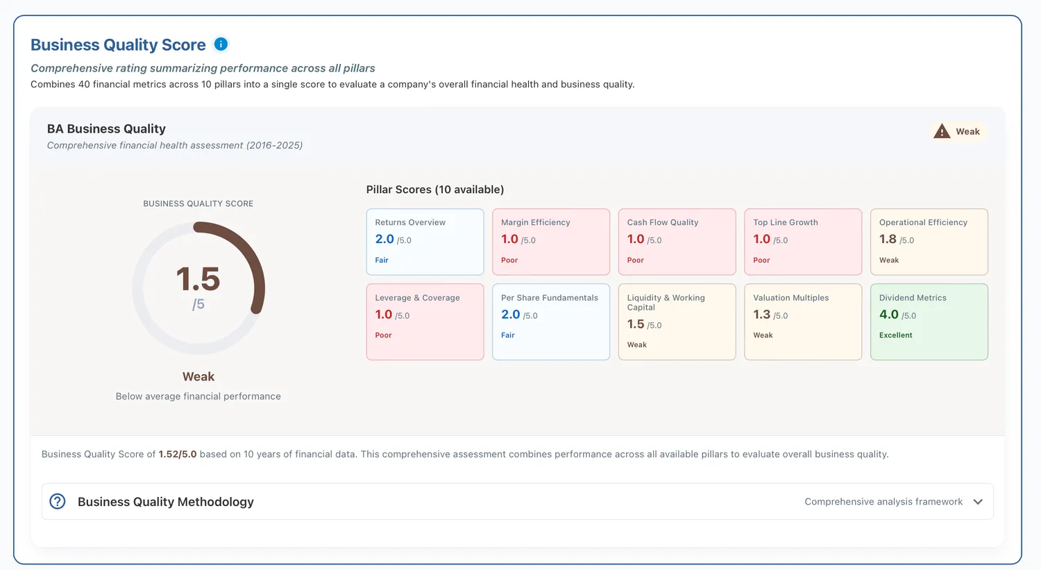
Figure 13: Boeing business qulity score card.
What Quality Cannot Reveal
Business quality analysis examines historical financial statements spanning ten years. This reveals past performance but cannot predict future disruption. A company with exceptional quality might face technological obsolescence, regulatory change, or new competition that fundamentals cannot anticipate.
Financial statements capture what happened but miss why. Quality scores identify strong returns and margins but do not explain competitive advantage sources. Is the moat a network effect, brand value, patents, or cost advantages? These qualitative factors lie outside quantitative analysis.
Market timing represents another blind spot. Quality companies can underperform during momentum rallies. Low-quality companies can deliver returns during turnarounds. Quality identifies strong businesses but does not predict short-term market behavior.
Industry context requires additional analysis. A 3.5 score might represent exceptional performance in a challenging industry or mediocre execution in a favorable sector. This is why Dimension 2 adds peer comparison to evaluate competitive positioning.
Building the Complete Picture
Quality analysis establishes the foundation. When quality scores exceed 4.0, the business merits deeper investigation. Peer analysis in Dimension 2 reveals competitive positioning through percentile rankings against competitors.
Valuation in Dimension 3 determines what to pay. A 4.0 quality score at 50 times earnings might represent poor value. The same quality at 15 times earnings could offer upside. DCF modeling combined with multiples establishes fair value ranges.
Analyst sentiment in Dimension 4 incorporates forward-looking professional views. Analysts project future earnings and margins based on industry knowledge. Holdings in Dimension 5 shows whether informed investors back views with capital. Insiders might sell quality businesses if they see deteriorating prospects. Institutions might accumulate weak companies if improvement appears likely.
When all five dimensions align, conviction strengthens. Quality with peer leadership, reasonable valuation, bullish analysts, and smart money shows alignment across dimensions. When dimensions diverge, investigation becomes essential.
Making This Actionable
Business quality separates companies that create sustainable value from those that destroy capital. The ten-pillar framework systematically evaluates returns, margins, cash generation, growth, efficiency, and financial strength across multiple years of data. This removes emotion and reveals patterns that surface-level analysis misses.
Scores above 4.0 indicate businesses that rank in the highest tier on these fundamentals. Scores between 3.0 and 4.0 reveal solid companies with specific strengths and weaknesses requiring context from other dimensions. Scores below 2.5 signal fundamental problems no valuation discount can overcome.
But quality alone does not determine investment merit. A quality business at an excessive price generates poor returns. A weak business at a deep discount might represent value if fundamentals improve. Quality provides foundation. The complete 5D Framework adds peer context, valuation analysis, professional sentiment, and ownership behavior to indicate alignment or identify risks.
Explore business quality for any S&P 1500 company with our Quality Analysis tool. The Quality page presents complete pillar breakdowns with ten years of underlying data. From there, examine Peers, Valuation, Analysts, and Holdings to build the complete analytical picture.
This article is an updated version of the blog originally published on X on 8 January 2026. It has been revised with new examples and refreshed data as of 15 February 2026.
Data sourced from Financial Modeling Prep API.
This article is for educational purposes only and does not constitute investment advice. Always conduct your own research and consider consulting with financial professionals before making investment decisions.