
Peer Comparison: Why Context Determines Quality
A 15% return on equity means nothing without competitive context. Peer analysis reveals whether performance represents excellence or mediocrity.

A company generates 15% return on equity. Is this good? For a regulated utility maintaining capital-intensive infrastructure, 15% ROE represents exceptional performance. For a software company with minimal assets and high margins, 15% ROE signals underperformance.
The same metric carries different meaning depending on competitive landscape. Absolute numbers mislead. A grocery retailer with 3% net margins might execute brilliantly. A pharmaceutical company with identical margins likely faces competitive problems. Industry characteristics shape what constitutes strong performance. Peer comparison provides that essential context.
Why Absolute Metrics Mislead
Different industries possess fundamentally different economics. Capital-intensive sectors like utilities naturally generate lower returns on assets because they require infrastructure investment. Asset-light businesses like software produce higher returns converting minimal capital into revenue.
Margin structures vary dramatically. Retailers operate on thin margins because competition limits pricing power. Specialty pharmaceuticals command premium margins because patents create temporary monopolies. A 10% net margin represents excellence for retail, mediocrity for pharmaceuticals.
Growth expectations differ by maturity. Established consumer staples might grow 3% annually while maintaining profitability. Technology companies might grow 30% annually. Evaluating both against the same threshold ignores market opportunity differences.
Universal thresholds fail because they ignore structural differences. The solution is abandoning absolute comparison in favor of relative positioning within competitive cohorts.
The Peer Comparison System
Peer analysis uses the same 40 financial metrics and 10 fundamental pillars as Quality Analysis. Returns overview, margin efficiency, cash flow quality, top line growth, operational efficiency, leverage and coverage, per share fundamentals, liquidity and working capital, valuation multiples, and dividend metrics all receive evaluation. But instead of scoring against fixed thresholds, the system calculates percentile rankings within peer groups.
Two comparison scopes provide different perspectives. Sector comparison ranks companies against all peers in their broad sector within the same market index. A Technology company in the S&P 500 gets compared to all other Technology companies in the S&P 500. This reveals positioning within the broader competitive landscape. Industry comparison narrows the peer group to companies in the same specific industry. A software infrastructure company gets compared only to other software infrastructure companies. This shows competitive standing among direct competitors.
How Percentile Rankings Work
For each metric, the system collects data for all companies in the peer group and calculates where the target company ranks. A company at the 90th percentile outperforms 90% of peers on that metric. The 50th percentile represents median performance. The 20th percentile indicates underperformance against 80% of competitors.
These percentiles convert to 1 to 5 scores using the same scale as Quality Analysis. Perfect 5.0 scores represent top decile performance, 90th percentile or higher. Strong 4.0 scores indicate above-average positioning, 75th to 90th percentile. Solid 3.0 scores show middle-of-pack performance, 50th to 75th percentile. Weak 2.0 scores reveal below-median results, 25th to 50th percentile. Poor 1.0 scores signal bottom quartile performance, below 25th percentile.
This percentile approach creates consistency across industries with wildly different characteristics. You cannot meaningfully compare absolute ROE between utilities and software. But you can compare whether each company ranks in the top quartile of its respective peer group. The percentile ranking adjusts automatically for industry norms while revealing competitive positioning.
Excellence Within Challenging Industries
CF Industries operates in Basic Materials, specifically agricultural inputs and fertilizers. This sector faces commodity price volatility, cyclical demand, and limited product differentiation. Yet CF scores 4.40 on sector peer comparison with perfect 5.0 on returns and 4.8 on margins.
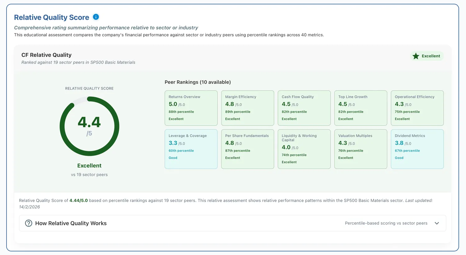
Figure 1: Relative Quality Scorecard for CF Industries
These scores reveal CF outperforms virtually every Basic Materials peer on profitability metrics. The company ranks in the top 10% of its sector for generating returns on capital. It exceeds 75% to 90% of peers on margin efficiency. This peer positioning indicates CF ranks among the highest in its sector on these metrics within a challenging industry.
The 4.5 cash flow quality score shows CF converts accounting profits to actual cash more effectively than most commodity businesses. The 4.5 growth score demonstrates the company expanded revenue and earnings faster than typical for mature industrial sectors. Across all major performance dimensions, CF ranks highest among its competitive peer set.
This pattern illustrates a critical insight. Absolute quality scores might not fully capture CF's strength because commodity businesses naturally score lower than asset-light models. But peer analysis reveals CF ranks highest among operators within its specific competitive arena. An investor seeking exposure to agricultural inputs would identify CF as the highest-ranked on these metrics through peer comparison even if absolute scores appear moderate.
Average Performance in High-Scoring Sectors
Apple scores 3.5 on sector peer comparison within Technology. This places the company solidly in the middle of its peer group despite being one of the world's most valuable and profitable companies. The apparent paradox reveals how peer context reshapes evaluation.
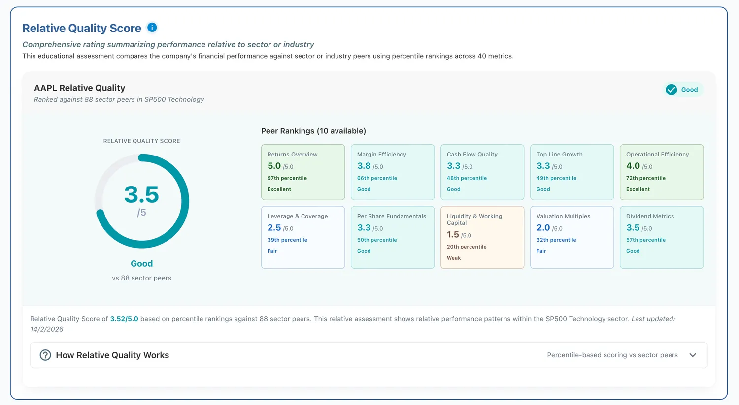
Figure 2: Relative Quality Scorecard for Apple
Apple's 5.0 returns score shows the company still ranks in the top 10% of Technology peers on profitability metrics. Return on equity, return on invested capital, and related metrics remain exceptional by any standard. But the 3.8 margins score and 3.3 growth score indicate Apple performs a bit higher than the median among Technology companies on these dimensions.
The Technology sector contains numerous extremely high-margin software and services companies. Apple's hardware-focused business model with 47% gross margins looks exceptional in absolute terms but falls to the middle of the pack when compared against pure software peers with 80% gross margins. The 3.3 growth score reflects that Apple's revenue growth, while solid, lags the explosive expansion of emerging technology companies.
This illustrates why peer comparison matters even for obviously successful businesses. Apple absolutely represents a quality company. But within the ultra-competitive Technology sector filled with high-growth, high-margin competitors, Apple's profile appears solid rather than exceptional. An investor comparing technology holdings would use peer rankings to identify which companies truly separate themselves from strong competition versus which maintain middle-of-pack positioning.
The peer context also reveals potential concerns. A company with Apple's brand strength and market position ranking in the middle on growth suggests maturation. Perfect returns combined with moderate margins and growth indicates a business maintaining profitability while expanding more slowly than sector peers. These patterns prompt investigation into whether the company faces saturation or competitive pressure.
Systematic Underperformance
Boeing scores 1.5 on sector peer comparison with perfect 1.0 scores on returns, margins, and cash flow quality. These rankings place Boeing in the bottom quartile of Industrials across every major profitability and efficiency dimension.
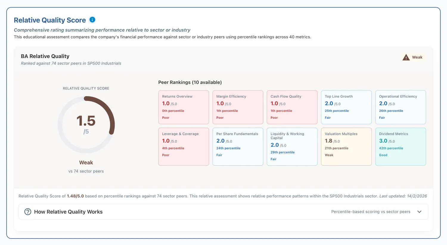
Figure 3: Relative Quality Scorecard for Boeing
The 1.0 returns score indicates Boeing ranks below 75% of Industrial sector peers on return on equity, return on invested capital, and related metrics. The company ranks below virtually all competitors on these return metrics. The 1.0 margins score shows Boeing converts revenue to profit less efficiently than the vast majority of industrials. The 1.0 cash flow quality score reveals the company struggles to generate actual cash even relative to reported earnings.
The 2.0 growth score provides the only slight relief, placing Boeing in the 25th to 50th percentile on revenue and earnings expansion. But this merely indicates the business contracts slightly less severely than the worst performers. The overall 1.5 score signals systematic competitive disadvantage across all major performance categories.
This peer comparison context makes clear that Boeing's challenges extend beyond temporary setbacks. The company underperforms the broad Industrial peer group on every dimension that matters for long-term value creation. Competitors in aerospace, defense, and industrial manufacturing generate better returns, stronger margins, and more reliable cash flow. Boeing's problems are not simply bad luck or cyclical headwinds. They represent fundamental competitive weakness relative to the peer set.
Visualizing the Scores
We’ve built three components to enable users explore companies through the percentile-based lens, without digging into code or raw spreadsheets.
Dot Plot
Each peer company is a dot positioned on a percentile axis, with background shading from poor to excellent. It lets you instantly see how a company stacks up against its competitors and where the distribution lies.
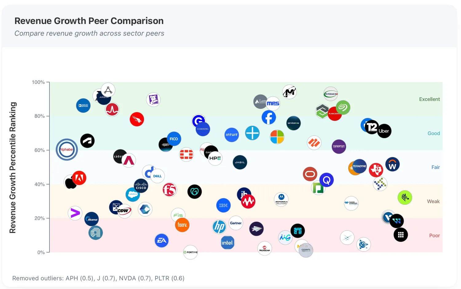
Figure 4: Dot plot comparing Google with its peers in the technology sector. Each logo marks a company, with percentile bands shaded from poor to excellent.
Gauge
A single metric percentile becomes a 1–5 score with labels like “Fair” or “Excellent.” It translates statistical ranks into language people understand, eliminating the need for number interpretation.
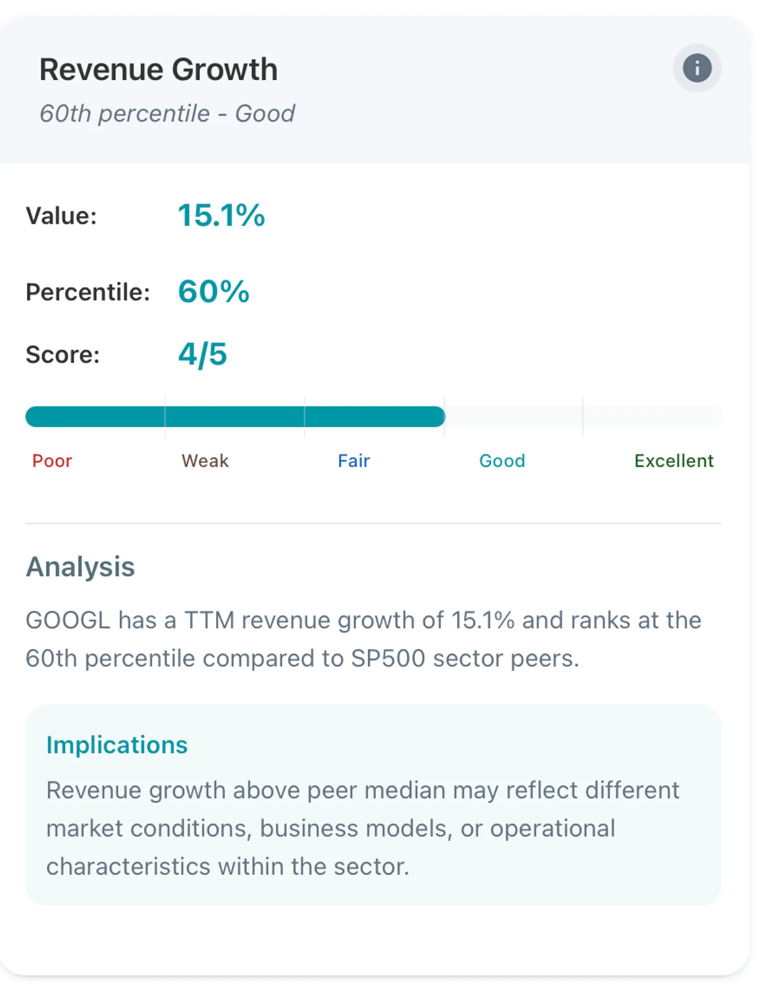
Figure 5: Gauge chart illustrating Google’s 15.1% revenue growth, placing it in the 60th percentile, ahead of 60% of sector peers and behind 40%.
Relative Quality Card
Consolidates 40 metrics into 10 key pillars, displaying a weighted overall score. It’s the summary view: sector and industry context side by side, so you can tell at a glance if a company is above or below its peers (examples given above).
Patterns to Watch For
Peer rankings reveal competitive dynamics through patterns across pillars. Companies scoring 4.0 or higher across most pillars demonstrate broad competitive advantages. They outperform peers on returns, margins, growth, and efficiency simultaneously.
Strong returns combined with strong margins signal pricing power and operational efficiency relative to competitors. This combination creates durable positioning. Weak growth combined with strong efficiency suggests a mature business defending market position through profitability rather than expansion.
Strong growth combined with weak cash flow quality creates concern. The company expands revenue but struggles to convert growth into cash relative to peers. Peer comparison reveals whether this represents industry norm or company-specific weakness.
Pillar divergence prompts investigation. A 5.0 on returns but 2.0 on leverage indicates strong profitability achieved through more debt than competitors. A 4.5 on margins but 1.5 on growth suggests optimization for profitability while competitors invest in expansion.
Connecting to the Framework
Peer comparison provides the competitive context that Quality Analysis alone cannot deliver. A company might demonstrate solid absolute fundamentals but rank poorly against direct competitors. Another might show moderate absolute metrics yet dominate its peer group. These patterns shape investment conclusions differently.
Quality Analysis in Dimension 1 establishes whether the business generates sustainable returns. Peer Analysis in Dimension 2 reveals whether those returns represent competitive advantage or industry average. Valuation Analysis in Dimension 3 determines whether the market prices that competitive positioning appropriately. Strong peer rankings commanding premium valuations might represent fair pricing or overvaluation. Weak peer rankings trading at discounts might represent value or recognition of competitive disadvantage.
Analyst sentiment and holdings behavior in Dimensions 4 and 5 gain meaning through peer context. Analysts might maintain bullish views on a company despite weak peer rankings if they anticipate improvement. Institutional investors might accumulate shares in peer leaders or avoid peer laggards. When peer rankings diverge from sentiment or ownership behavior, investigation becomes essential.
The complete framework synthesizes these signals. Quality fundamentals combined with peer leadership, reasonable valuation, bullish sentiment, and smart money accumulation shows alignment across dimensions. Weak peer positioning contradicted by institutional buying demands explanation. The peer dimension rarely determines decisions alone. It provides one essential lens in the comprehensive evaluation.
Making This Actionable
Peer comparison transforms abstract financial metrics into competitive positioning assessments. Rankings reveal whether companies outperform, match, or lag their direct competitors across fundamental performance dimensions. A 4.0 peer score indicates top quartile positioning. A 3.0 score shows middle of the pack performance. A 2.0 score signals underperformance against most rivals.
But these scores gain meaning only through context. Excellence in a challenging industry might produce better risk-adjusted returns than mediocrity in a favorable one. Peer rankings identify competitive leaders within their specific arenas. Investors then decide whether they want exposure to those arenas at all.
The percentile approach solves the industry comparison problem that plagues absolute metrics. You cannot compare grocery margins to pharmaceutical margins meaningfully. But you can identify which grocer and which pharmaceutical company outperforms their respective peer sets. This enables genuine comparison across sectors while maintaining industry-appropriate context.
Explore peer comparison for any S&P 1500 company with our Peer Analysis tool. The Peers page presents percentile rankings across all 10 pillars with interactive charts showing positioning against sector and industry competitors. From there, examine Quality, Valuation, Analysts, and Holdings to build the complete analytical picture.
This article is an updated version of the blog originally published on Medium on 1 September 2025 and later on X on 13 January 2026. It has been revised to include new examples and updated data as of 15 February 2026.
Peer rankings based on trailing twelve month (ttm) data compared against S&P 500/400/600 sector and industry peers as of February 2026. Data sourced from Financial Modeling Prep API.
This article is for educational purposes only and does not constitute investment advice. Always conduct your own research and consider consulting with financial professionals before making investment decisions.