
A Stock Screener Where Quality Companies Literally Rise to the Top
How we combined D3 force simulations with financial data to create a screening experience that mirrors real market dynamics.
For the past three years, we've been working on making financial data more intuitive and beautiful. Traditional stock screeners work, but they're boring with rows of numbers in tables that require you to mentally parse which companies meet your criteria. We wanted to build something where you could see quality emerge in real-time.
After experimenting with various visualization approaches, we landed on something that felt revolutionary: a stock screener where high-quality companies literally float to the top of your screen as you adjust your criteria, while weaker performers sink down or disappear entirely.
The Vision: Market Forces as Literal Forces
The core insight was simple: in real markets, quality companies do tend to "rise to the top" over time. What if we could visualize this process happening instantly as investment criteria become more demanding?
Imagine adjusting a profitability filter and watching profitable companies bubble up through the visualization while unprofitable ones sink. Tighten debt requirements and see overleveraged firms fall away. Apply multiple quality criteria simultaneously and witness only the true cream-of-the-crop companies floating at the top.
This isn't just eye candy: it's a fundamentally different way to understand how screening criteria interact and which companies survive increasingly rigorous quality standards.
Two Approaches to Screening
Rather than forcing users into one screening methodology, we built two distinct modes.
Simple Mode focuses on business quality using ten fundamental pillars: profitability, growth, financial health, operational efficiency, and more. Users set minimum thresholds for whichever aspects matter most to their investment philosophy. It's Warren Buffett-style fundamental analysis made visual.
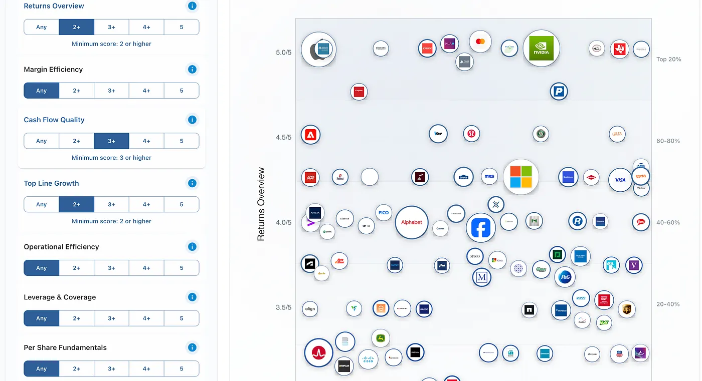
Figure 1: Simple Mode. Filter companies by fundamental quality pillars like profitability, growth, and financial health. Each pillar uses intuitive threshold controls.
Advanced Mode provides granular control with 40+ financial ratios across six categories: margins, returns, liquidity, leverage, valuation, and operational efficiency. Power users can create complex multi-criteria screens to filter companies.
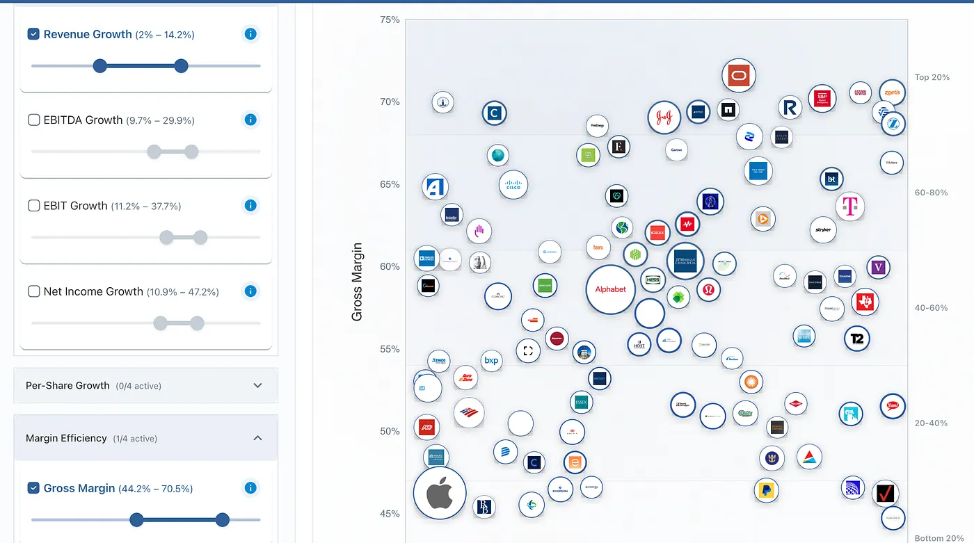
Figure 2: Advanced Mode. Granular screening with 40 financial ratios across 10 categories, including margins, returns, liquidity, leverage, valuation, and operational efficiency.
Both modes use the same "cream rising" visualization: the magic happens in watching companies sort themselves as your standards become more demanding.
How It Works
The screener transforms traditional stock filtering into an intuitive visual experience. Companies appear as bubbles across your screen, with larger bubbles representing higher market capitalizations.
Set Your Quality Standards: Use the dual-mode approach: either set simple thresholds for business health pillars like profitability and growth, or dive deep with precise ranges for specific financial ratios like debt-to-equity or return on assets.
Choose What Rises: Select any financial metric as your sorting criterion. This determines what causes companies to appear at the top, whether it's return on equity, profit margins, revenue growth, or any other fundamental measure you value.
Watch the Separation: As you apply filters, companies that meet your standards appear at the top, while those that don't sink toward the bottom. It's market dynamics made visible: you're watching quality separate from mediocrity in real-time.
Refine and Explore: Adjust thresholds on the fly and watch companies move instantly. The force simulation ensures similar companies naturally cluster together, revealing patterns that static tables miss.
The visualization caps at 100 companies to maintain smooth performance, but the full filtered dataset remains available in table format for detailed analysis.
Geographic and Sector Context
Beyond financial metrics, the screener includes essential market filters that provide geographic and industry context to your analysis. Filter by country to focus on specific markets. Exchange filtering adds another layer of precision, useful for targeting specific market segments like NASDAQ growth stocks or NYSE blue chips. These foundational filters work seamlessly with the financial metrics: apply them first to establish your investment universe, then layer on the fundamental analysis.
"Higher-is-Better" vs "Lower-is-Better" Metrics
The visualization intelligently adapts based on the metric you choose. For most financial ratios, such as return on equity, profit margins, or revenue growth, higher values indicate better performance, so quality companies naturally float upward.
However, some metrics work in the opposite direction. With price-to-earnings ratios, debt-to-equity ratios, or price-to-book values, lower numbers often signal better value or financial health. When you select these "lower-is-better" metrics as your sorting criteria, the platform automatically sorts them so that lower values appear at the top: quality companies always rise, regardless of which direction the metric runs.
Table View
While the bubble visualization captures attention, serious investors often need the precision of traditional tabular data. Switch to table view to access the complete filtered dataset with sortable columns, search functionality, and detailed company information.
The table displays essential data points, such as company names, sectors, latest closing prices, and 52-week ranges in a clean, scannable format. Click any column header to sort the entire dataset, or use the search bar to locate specific companies within the results quickly.
Each company row includes a logo that links directly to comprehensive research dashboards, bridging the gap between initial screening and deep-dive analysis. The table also handles larger datasets gracefully; while the bubble visualization caps at 100 companies for smooth performance, the table displays your complete filtered universe, whether that's 50 companies or 500.
This dual-view approach recognizes that different investors prefer different interfaces. Some love watching the visual drama of companies sorting themselves; others want the analytical precision of traditional financial tables. The same powerful filtering engine drives both views, ensuring consistency whether you're exploring patterns visually or analyzing numbers systematically.
Try It Yourself
Sometimes the best way to understand data is to watch it move. Try it on the Screener page.
This article was originally published on Medium on 3 September 2025. All data, prices, and results reflect information available at the time of publication. We have retained the original publication date on this platform for consistency.
This article is for educational purposes only and does not constitute investment advice. Always conduct your own research and consider consulting with financial professionals before making investment decisions.